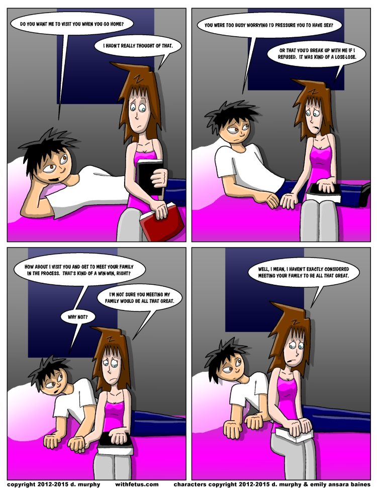

January 26, 2015 - This panel layout looks familiar. Experimenting with a different font and line widths, though I certainly wasn't consistent with the directionality of the light hitting Aaron's face. :-\
-D
-D
comments powered by Disqus


